Brand performance visualization and analysis tool for Unilever
Led the design and development of Unilever's brand-power analysis tool, accelerating access to consumer insights for marketing teams and reducing manual reporting work across markets.
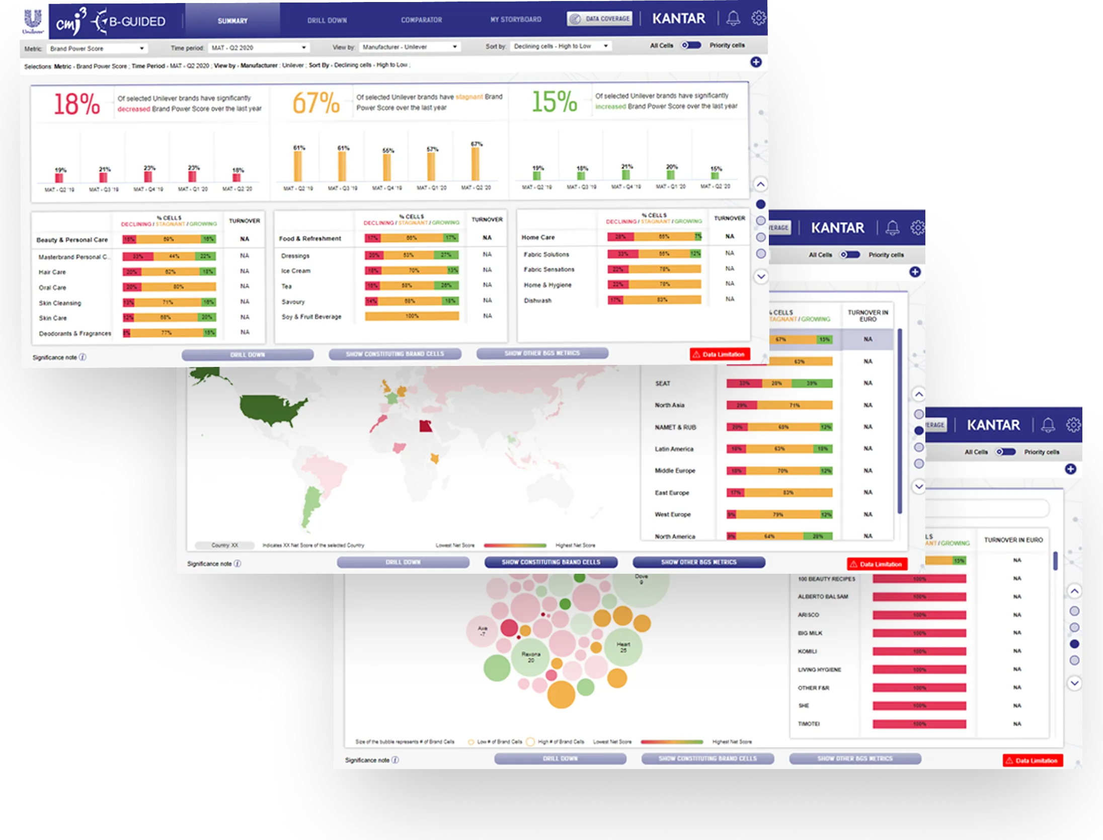
Unilever periodically conducts consumer research studies across multiple markets to understand how their brands are perceived. But the process to translate this research into insights was time consuming and de-centralized, making it harder for the senior leadership teams to get an aggregated view of performance across markets. As Unilever’s insights partner, Kantar was briefed to build a web tool that automated the process of reporting research data across hundreds of brands in different markets and enabled marketing teams to easily analyze the drivers of performance. On behalf of Kantar, I led the design and development of this tool end to end.
Discovery: three user types with distinct needs
I led the discovery research to clarify who the tool needed to serve and what value it had to deliver. Interviews with Category VPs, Directors, and Marketing Managers surfaced three user types across the organization, each with specific functional and data needs that informed the product’s architecture and feature set.
- Senior leadership needed performance aggregated at company, category, geography and brand level to understand performance at-a-glance at different levels.
- Brand and insights managers needed to go past the headline performance numbers and understand what was driving them.
- Analysts needed to build custom reports for their teams quickly, without starting from scratch every reporting cycle.
Modular architecture over a single dashboard view
Built a modular architecture with modules tailored to the different needs of each user type.
The requirements of the three user types were so distinct that accommodating them in a single view was not possible. So instead of one dashboard, I structured the tool as four modules, built around the users’ distinct jobs. The trade-off was that four modules meant more to design, build and maintain, and a risk the tool would feel like four separate products. I reasoned that separate views which fit how different users actually worked would earn more use than a compromise that fit no one well.
Cohesive design for distinct interfaces
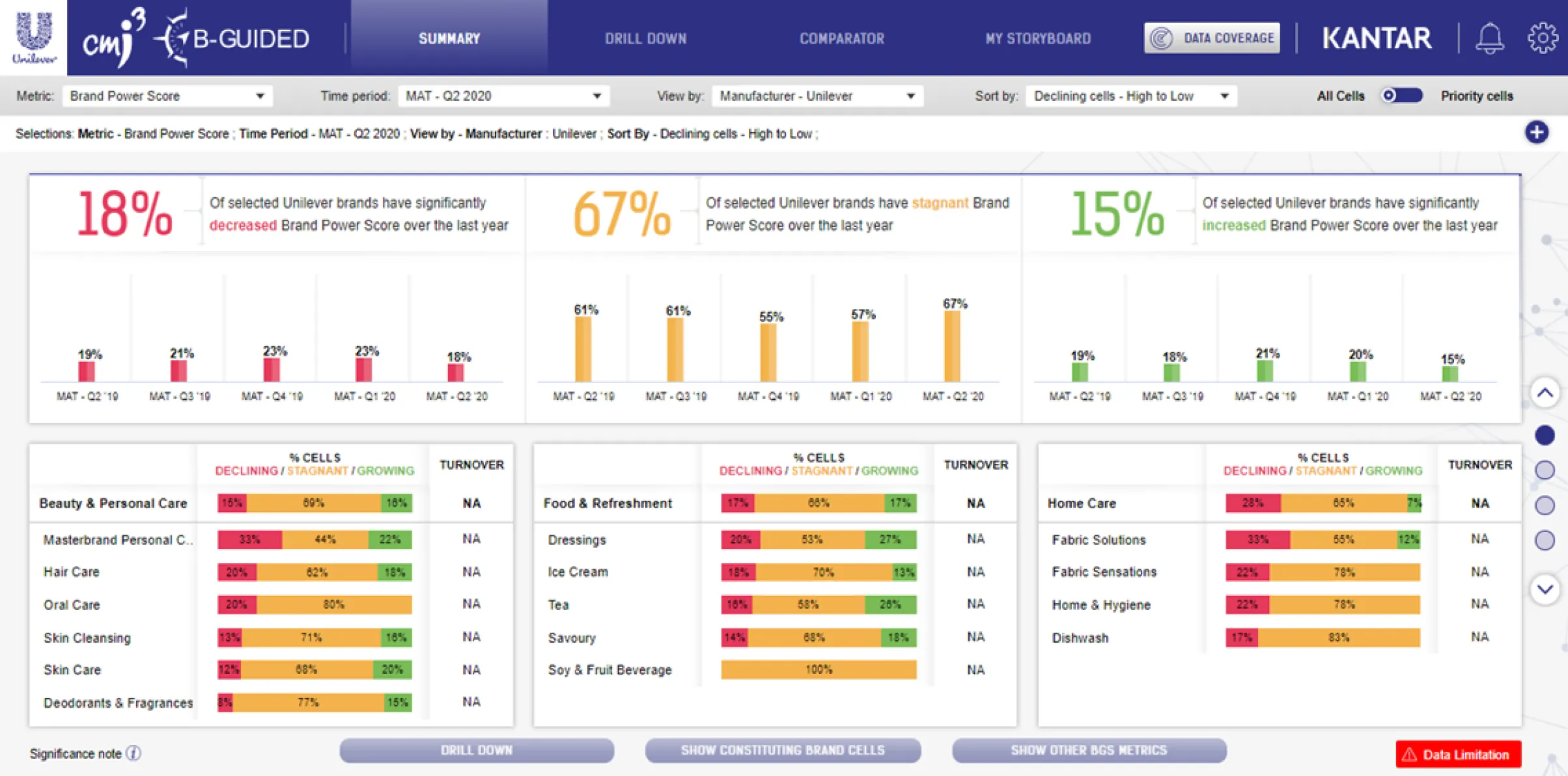
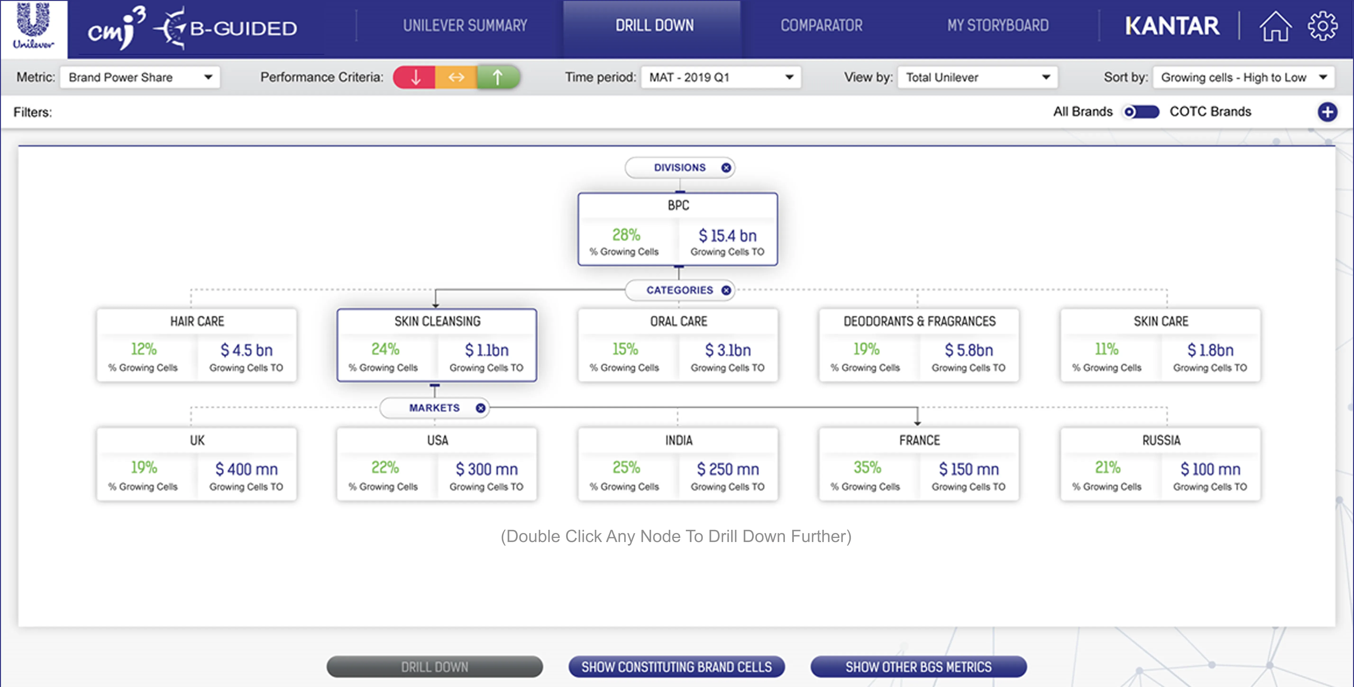
To design the interfaces of the modules, I worked iteratively: sketching on paper, moving into wireframes, and then building high-fidelity screens with our visual design team, checking each view with stakeholders along the way. The aggregation view surfaced overall company performance first, then broke it down by division, category, geography, and brand as you scrolled, giving leaders a clear picture of both performance and its sources.
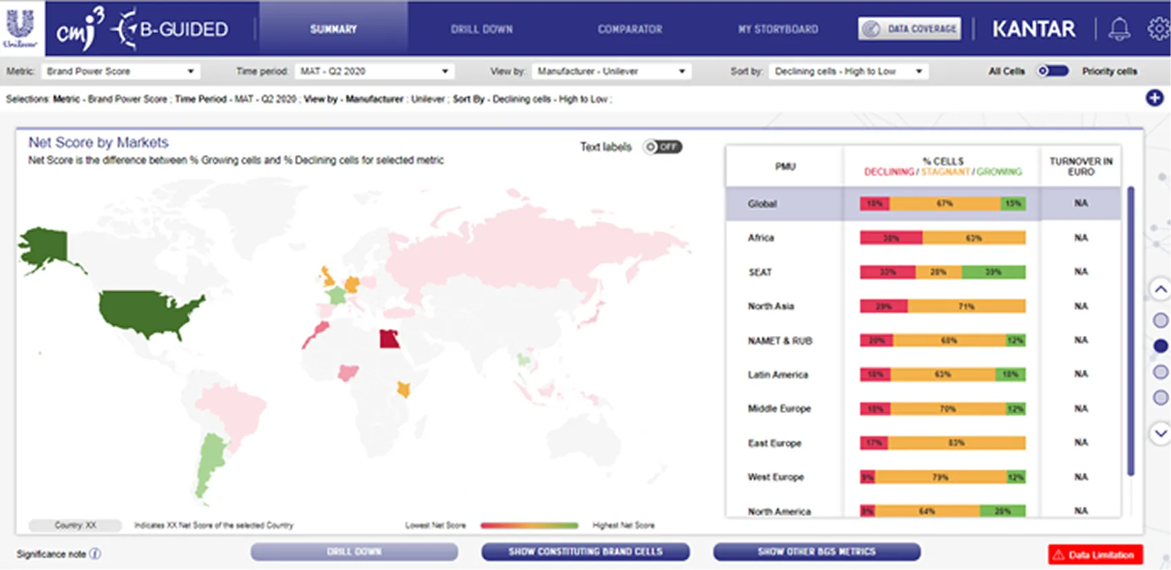
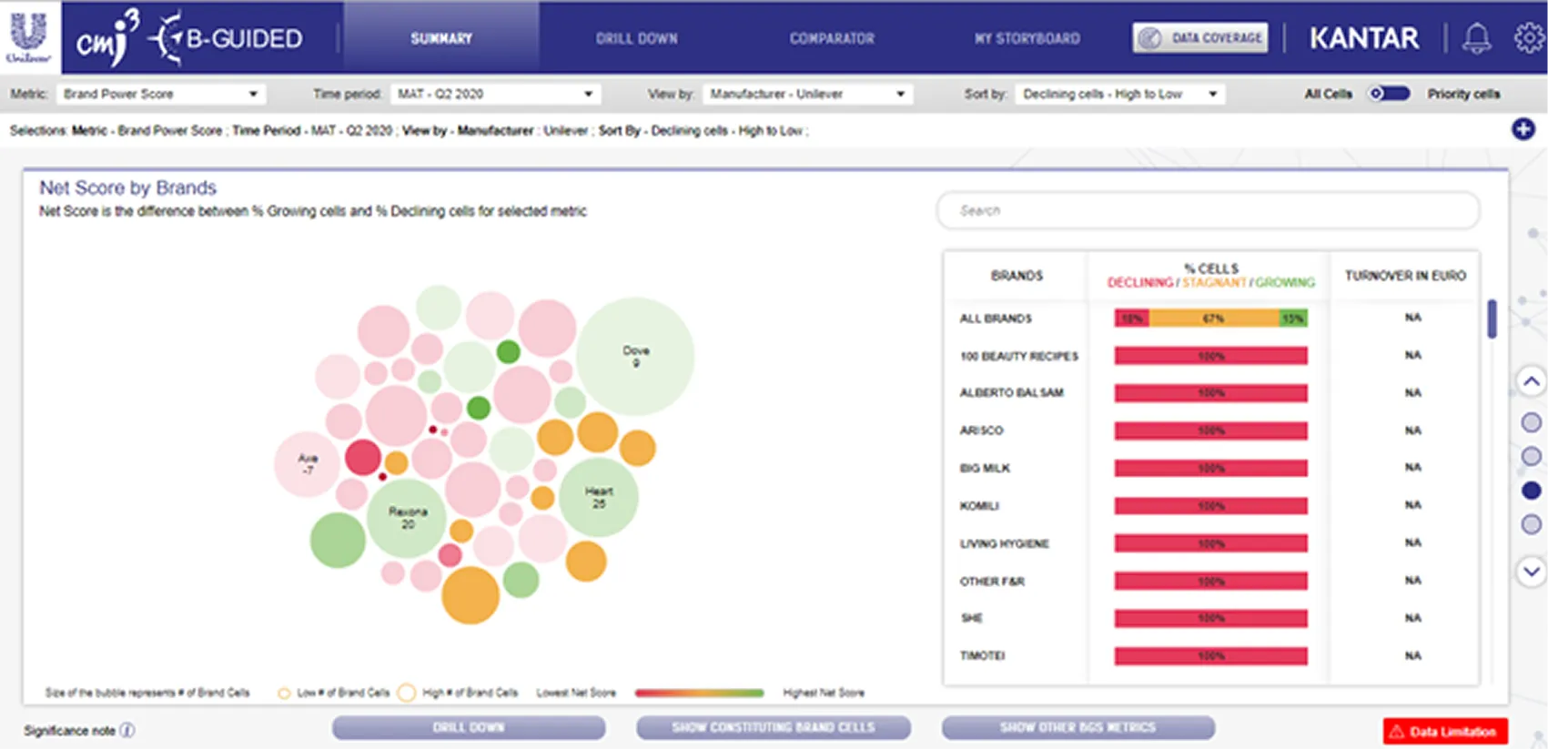
For managers, I designed a driver-analysis view that let them choose a starting point and slice the data to understand what was moving the numbers.
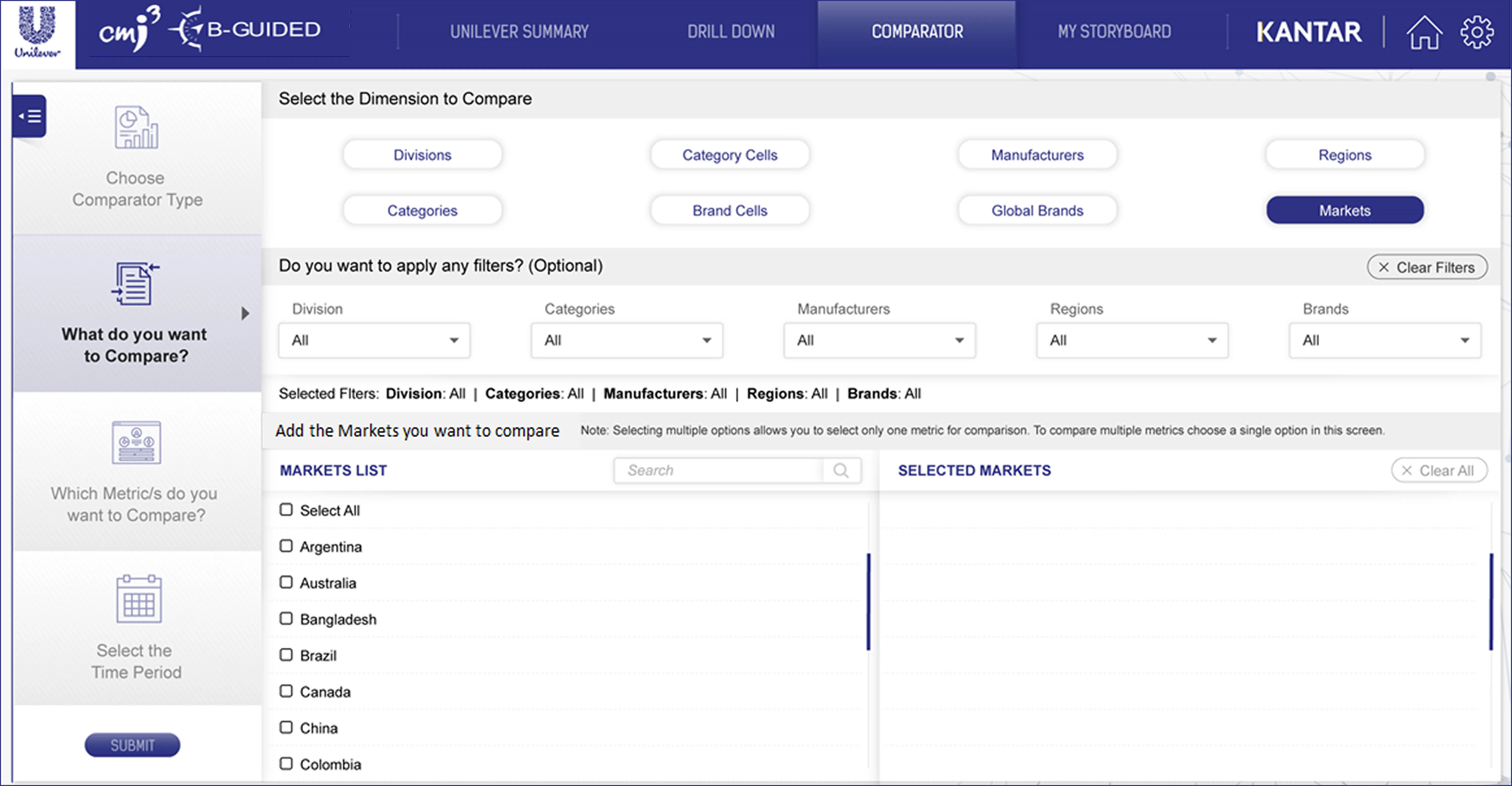
The requirement a fixed set of screens couldn’t meet was reporting. Each brand team’s needs varied too much for any preset view to work. I designed the Comparator, a reporting interface that guided analysts through four steps: selecting metrics, choosing comparisons and time periods, generating charts, and saving them to a storyboard they could revisit and update. This enabled teams to set up their required reports once and have them auto-update periodically.
Building the backend data pipelines
New research data was released every month, and the tool needed to update as soon as it became available. I led a team of analysts and data engineers to map all data sources, set up harmonization and quality-check processes, and build backend automations so the tool could refresh itself with minimal manual effort. This ensured the front end always presented accurate, up-to-date insights.
Outcome
I helped launch the tool across Unilever’s global and local brand teams over a series of demo sessions. After the launch, I led the ongoing maintenance of the tool and helped build a roadmap of features based on user feedback and new user needs I identified.
Unilever’s monthly brand performance reports that once required heavy manual effort were replaced by the Brand Power analysis tool, freeing analysts for higher-leverage work and giving leaders and managers a faster route from research to decisions.
For Kantar, the tool turned a one-off project into a lasting engagement. Unilever kept it on an annual retainer, renewed and expanded year after year as we added markets and features, which made it a continuous source of revenue for the business and the clearest sign the tool had earned its place in the organization.