Research-led modernization of a legacy IT platform
Adopted a strategic 'Jobs-to-be-Done' approach to lead the modernization of a legacy B2B SaaS product.
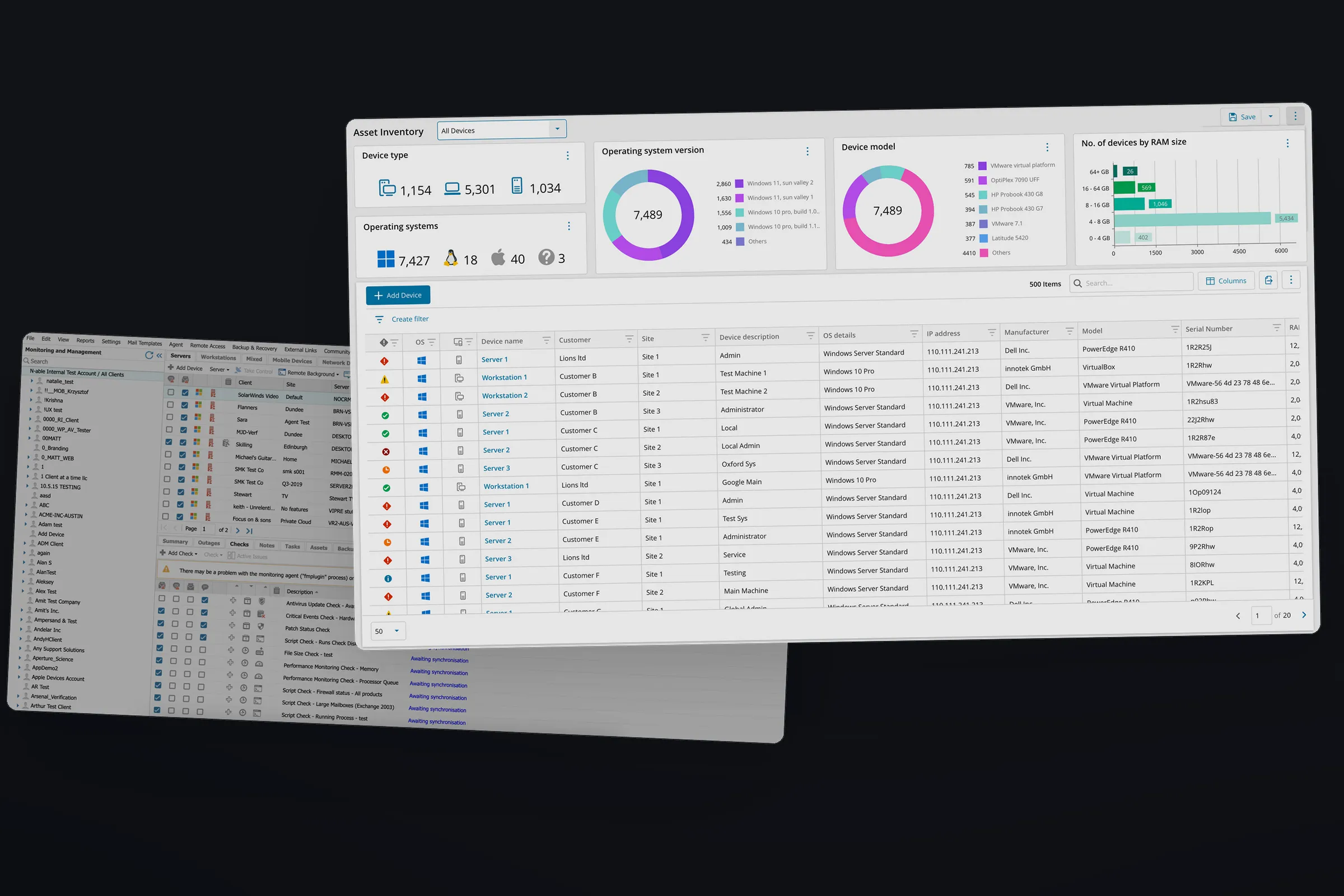
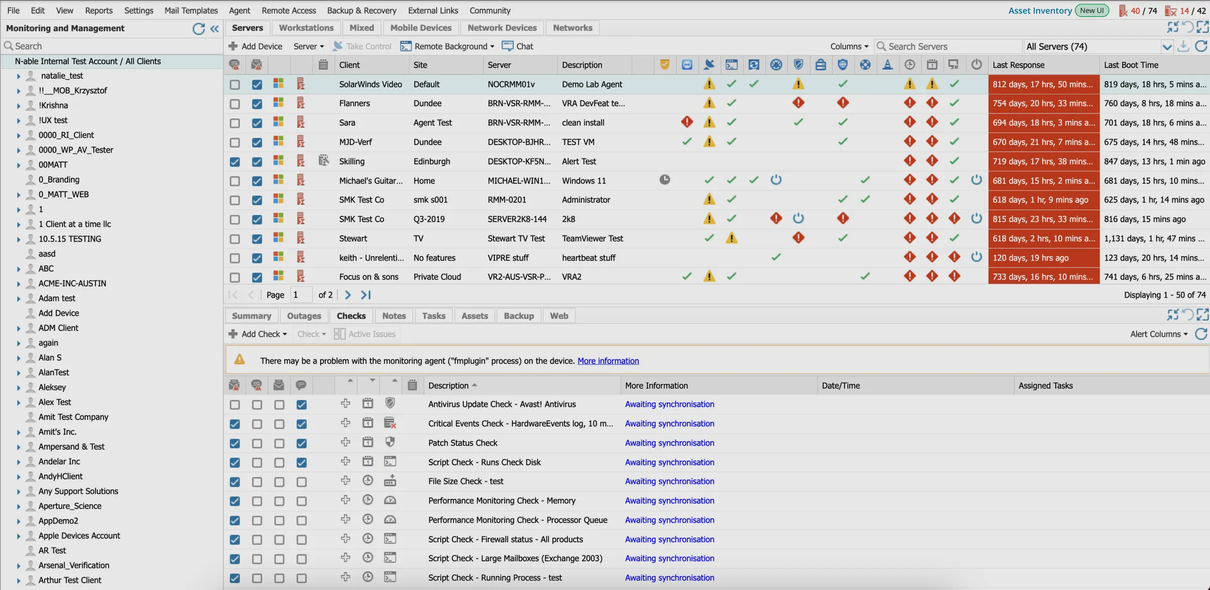
N-sight is a market leading B2B SaaS platform that IT Managed Service Providers use to provide IT services for small and medium businesses. As newer competitors gained traction with more contemporary interfaces, N-sight’s growth began to plateau. Market research confirmed that the dated UI was eroding customer confidence.
The mandate for the Product and UX teams was to address this challenge by modernizing N-sight’s interface, but modernization was just the means. The real work was to understand how N-sight’s users (IT technicians) engaged with a large, complex product and to identify where interface changes would meaningfully shift adoption and satisfaction. I led this initiative from a UX standpoint, defining the modernization approach and delivering an improved product experience for the technicians.
Modernizing a live product without disrupting the experience of thousands of users
Modernizing a legacy product this size is a huge undertaking. A full redesign would have been the most expensive path and the slowest to show value, and the easiest to derail over a multi-year build. The approach we settled on was to modernize in small value increments over two to three years, each release built around a whole job technicians came to N-sight to do rather than by features. The trade-off was real: technicians would live with a mixed interface for a long time, part new and part legacy. In exchange, each release carried far less risk and let us learn from real usage before committing to the next set of design changes.
To make that prioritization concrete, I initiated an internal research exercise to pin down our technicians’ jobs to be done (JTBDs). Drawing on the PMs’ product knowledge, I ran stakeholder interviews and workshops to build a list of jobs and align the team on the three core jobs that would drive the initial modernization efforts. I worked out the prioritization together with the PMs as I was closest to the user research.
Understanding how technicians actually work
To design a modern interface that actually improved the experience, we first needed a clear picture of how technicians used N-sight to accomplish their core jobs and where the current UI was lacking. The UX research team ran one-on-one “show me” sessions where technicians walked through each job live in the product and explained the challenges they faced. I supported the research and led the synthesis afterward, bringing Product, Marketing, and Support into the process so they could see real usage patterns firsthand. From there, I translated the themes into insights and actionable product requirements with the PMs.
Technicians work with large volumes of device data, and they needed more flexibility in how they view, filter, and customize it.
Across all three jobs, the insights pointed to a consistent need: technicians work with large volumes of device data, and they need more flexibility in how they view, filter, and customize that data. The legacy interface locked them into a fixed view, forcing them to export data and manually customize it outside the product. Modernizing the interface meant solving this core workflow, not just updating the visuals. The easy version of modernization would have rebuilt that same rigid workflow behind cleaner styling and left the real problem untouched, but user research helped us identify the right approach.
A better interface for high-volume data
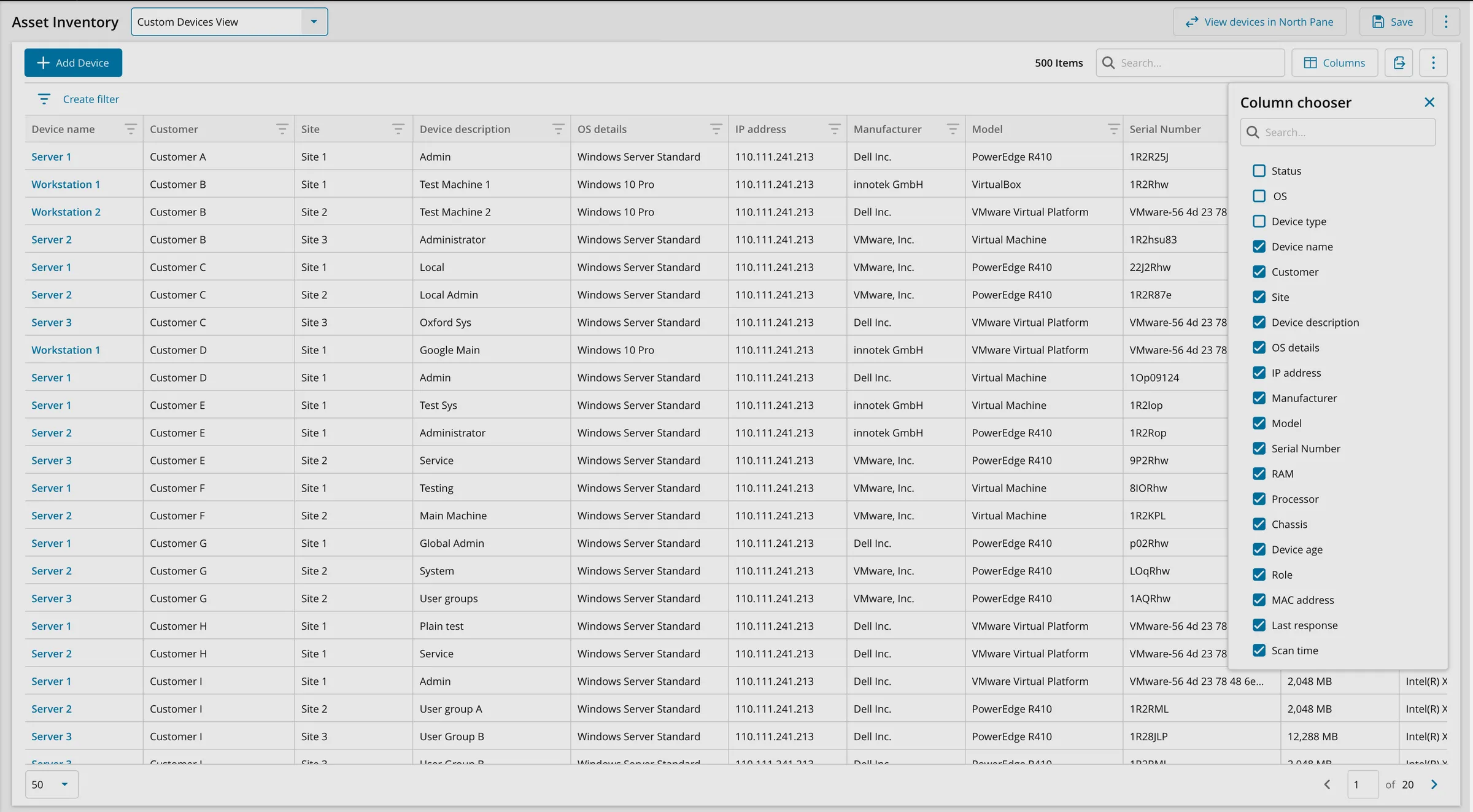
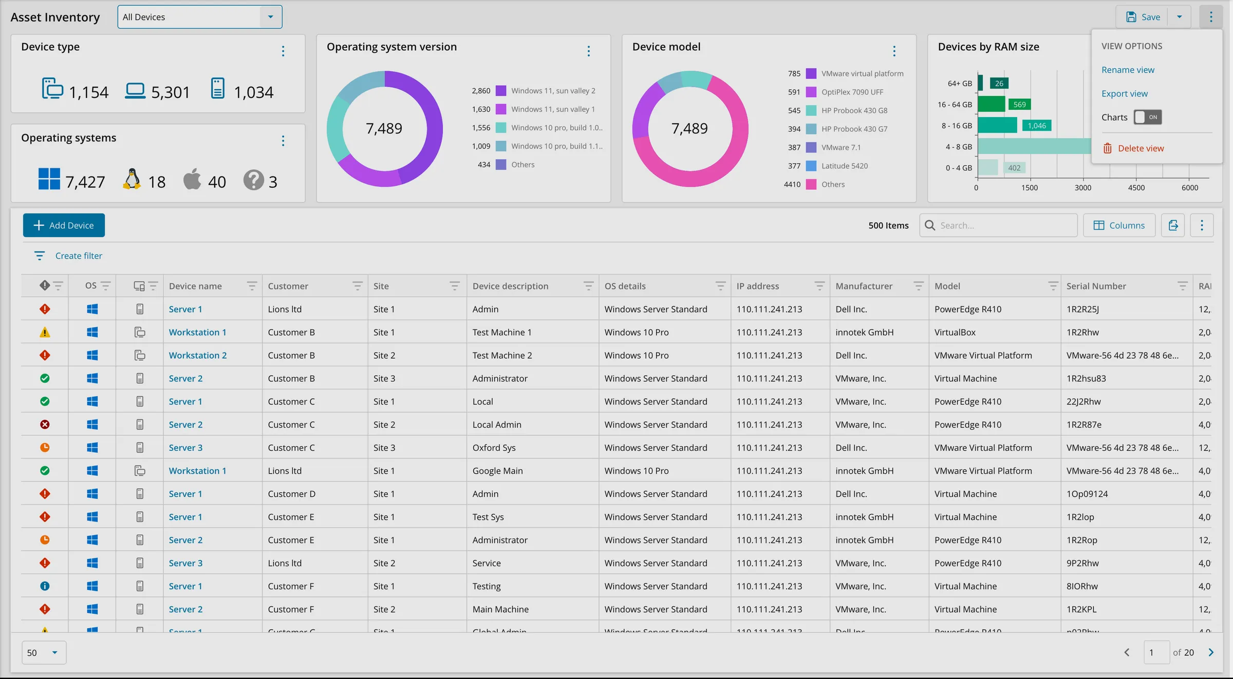
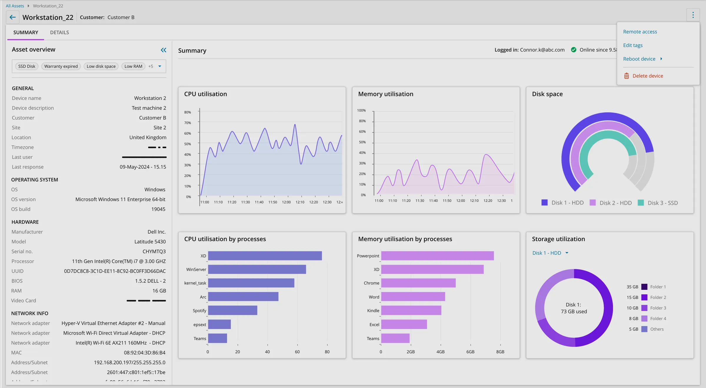
To meet that need at scale, I built the concept on the datagrid component from our DevExtreme based design system, so one interface layer could stretch across all three jobs rather than three bespoke screens. Some of the key features designed were:
- Customizable data grid: let technicians choose and order the columns they saw.
- Saved views library: let technicians save customized data views they could return to any time.
- Customizable chart widgets: gave technicians an overview of the asset inventory and any urgent issues.
Ad-hoc user research confirmed that the concept was the right design direction and told us which data points technicians most wanted surfaced. Then, with a junior UX designer, I turned it into a prototype and led usability testing with five technicians, reworked the handful of areas the testing flagged, and retested with internal participants before the design went to build.
Outcome
The extensive research and iterative testing helped the Product team confidently release the new modern interface to ~35,000 users, giving them a faster, more flexible way to work with their device asset data. This was the first of many releases to modernize the N-sight platform. Customers gave a positive response to the initial release of the modern interface with encouraging comments on the customer forums and an average CSAT rating of 86%.
-
“This resource replaces our Excel and we can present it in real time to the client!”
Rodrigo G
-
“It looks great and is fast and easy to use. This will be really appreciated by the MSPs !”
Daniel G
-
“I just wanted to drop you a quick email with some positive feedback and say that the new Asset Inventory section of RMM is really helpful and is already saving me so much time – thank you!”
Donald M
-
“Clean & Simple Interface. Easy to read & understand !!!”
Alan H
The initial release also paved the way to scale the modernization efforts by continuing to build on top of the new data grid component, which became one of the central views that technicians started using.